REPUTATION™ // an app for bands to network, book and promote shows, and stay connected

Band Profiles include albums, songs, bio, calendar, and community reputation based on ratings
As a musician who spends a lions share of my time with other musicians, I found a great need in our DIY music communities for a fast, safe, and effective way to book and bill shows. As it stands, the search functions in our current resources (Bandcamp, Instagram, Facebook, and Spotify) do not allow for musicians to find one another by location, genre, or activity. Too often, I’ve struggled to book shows in my own or other cities because I couldn’t network with other bands (unless we had already found friendship forged in the crucible that is DIY touring). As DIY artists, we don’t want to sign our tours off to labels, we would much rather have our say in who we play with and where. Reputation is an attempt to gather bands and venues to a singular platform where they can book, share music, network, organize and promote. All without having to sign to a label.
The more I learned of design, the more ideas I had…

first low fidelity prototype of REPUTATION
Early on, my head was spinning with possibilities. I could made this app into anything and everything I wanted it to be. But I needed to start with what I thought might be most important, so I focused my attention on organization. Musicians can be free spirits and, a lot of the times, struggle to keep a tight schedule. Not for lack of trying, of course, we just have a lot of thoughts flying about our heads. This is one reason that it seems appealing to sign to a label- what better way to live then to focus on your art while someone else takes care of the scheduling and booking? Sadly, there are a lot of pay cuts for musicians when they agree to this kind of service from labels. Additionally, the artist often looses some artistic autonomy when they sign to a label. I wanted to great REPUTATION as a networking space to organize, to promote, to book, and make lasting connections with other artists. All while allowing communities to speak openly about their experiences at different venues or with different bands. I wanted a space that fostered safety and accountability as well as artistic autonomy.
Musicians might be free of spirit, but we are ruthlessly persistent. I began to refine REPUTATION…

As I moved from low to high fidelity mock ups of REPUTATION, It became clear to me how every detail of the user experience needed acute consideration. Would users want to compare venue dates? How about listen to bands as they continue to browse the app? I tried very hard to consider as many details as I could while being in the headspace of the user…

But I was wrong in my assumptions that I knew exactly what the user wanted. And my user testing proved that…
The most significant feedback I got on my first round of user testing was that the home screen didn’t clearly illustrate what the function of the app was. I wonder now if some onboarding screens would have solved that problem. I may return to some of these versions of the home screen after developing some onboarding UX.

I also began experimenting with background design- as I began working on this app, I also began employment at a venue and bar in Downtown SLC that had a very black and white aesthetic. I adopted some of that aesthetic into this app, thinking perhaps this app would function best as a “local SLC only” kind of an app. But I felt snubbed by the shortcoming of “local only” (not to say local is bad, I actually LIVE for local communities, but the true value in an app like this is being able to reach bands and venues in other cities so that national and international touring is a more viable option outside of label signing). And so I user tested this version as well and I found…

I needed to do another Competitive Audit…
The second biggest piece of advice I got after revising the home screen was, “why isn’t this app more like apps I have already used?”. My users were referring to other booking apps that they’ve used, specifically DELTA, EXPEDIA, and BANDCAMP. I began basing my aesthetic off of BANDCAMP’s app in order to 1. get a feel for how the big dogs do it and 2. possibly appeal to those big dogs. Musicians use travels apps when they books shows in other cities. The first thing they want to do is input where they are going. Next, they expect to see an available place for them once they’ve inputed where they are touring. EXPEDIA and DELTA were very informative in how the home screen could function- the user should be able to accomplish the goal of booking first and foremost. So the home screen was redesigned to encourage booking LOCATION and DATE first.

This introduced a new UX challenge- does the user want to first book a show at a venue or look for bands to play with? I needed to think of a design solution that allowed the user to do either with no confusion. Additionally, I needed to let the user explore and find bands and venues. The idea, after all, is to expand ones network, not stay where its comfortable all the time.
So I limited the action buttons on the home page to reflect the true goal- book with venues or book with bands…
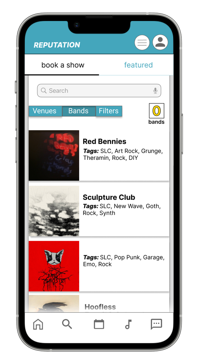
With less actions buttons on the homepage, it’s very clear that your options are to either hit the venue tab or the band tab, and thus begins your search. It’s minimal and reduces user confusion. I also loved how Bandcamps search function is very colorful, so I ripped that off as well…


However, BANDCAMP’s search functions have historically been atrocious. I wanted the search to BEGIN with things like location, tags, and activity. It’s VERY challenging to find bands on bandcamp by location. Even more difficult is finding bands based off of activity. Too often, I find the PERFECT band to play with (after many pain points in the search) only to find that the band hasn’t played a show in 8 years. This is an exhausting experience and I hope that REPUTATION can alleviate the toil of booking shows and tours.

Lastly, It was important to the users to compare dates quickly and easily…

As well as review venues and bands so that you know you’re booking with great people…

and be able to listen to the band’s music while they browsed the app…

And easily see when their requests for shows have been denied or accepted …

Moving forward…
I plan to do another usability test as well as submit my design to some slack groups for review. I believe that any remaining flow and design issues will be resolved this way. The flow and design can be further accessed via THIS figma link!